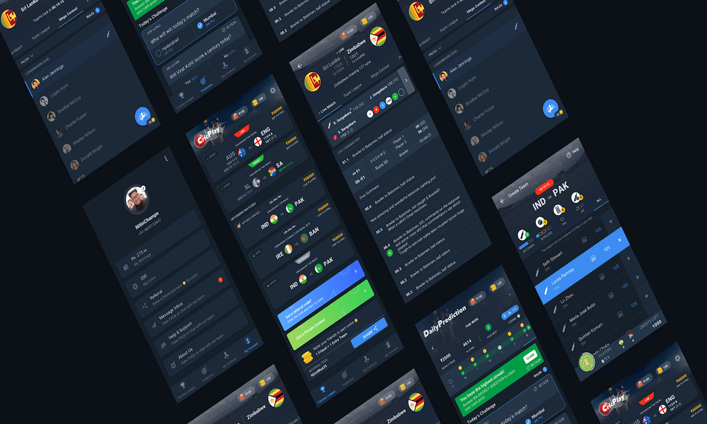
Dark mode UI was applied on a larger scale by some of the biggest brands in 2019. Ever since then, it has become one of the hottest trends in 2020 when we talk about UI designing. The response based on the user experience is thrilling and encouraging. Users are found getting crazy about the dark mode themes after getting the dark mode UI options in MacOS, Apple iOS, and Android.
This blog depicts the right way to do it, how to create stunning yet meaningful dark themes for a mobile app and/or a responsive website.
But first, let us understand some apparent and instant benefits users get via opting the dark mode option if provided.
Why are Users in Love with the Dark Mode so much?
Improves Readability & Visibility
Dark themes instantly reduce eye strain and have been proven a great option for night time periods. Try if you haven’t, it’s a really really cool thing.
Enhanced Battery Performance
Facing battery issues? Not to worry now. Dark mode UI and icons have a greater impact on smartphone battery. It prolongs battery life.
Vibrant Visual Content
The colors, design, icons, or any atomic element can be emphasized brilliantly to portray overall emotional appeal to the users.
There are also CONS associated with the dark mode UI, and you must understand them before going to read the tips to create dark themes. It will do good to your understanding.
Cons of Dark Mode UI
Awkward in Low Light Areas
Websites and applications with dark themes are harder to use when the light is low which is not ideal to the eyes. Users may end up increasing brightness that puts prolonged battery life out of the equation.
Ideal for Visual Content Only
Dark theme is just not fit for websites and applications with heavy-text content. Textual content is more readable in light mode UI. Best example in this context would be viewing the Netflix app.
Dark mode isn’t for ALL
Several researches suggest that light mode when compared to dark mode is more user-friendly and offers advantages for visually impaired people. For normal users, light mode helps in better concentration too.
As a result, one should consider all these factors and relate them to the product, business goals, target audiences, usability of the web app or mobile app. That should do good to the end product with lesser iterations. When you want to give a dramatic look to the visual elements with minimised distractions, and want to support the overall hierarchy with drawing the visitors attention to colorful elements, dark mode is the perfect fit.
Tips to Create Perfect Dark Themes
Stay Away from Pure Black & White
It means that designers should never go for a pure black (#000000) background with the pure white text. Reason is that for humans, high contrast could be painful to the eyes. It brings more strain to the eyes and hampers overall readability and purpose.
Material design that’s why suggests a #121212 (or #333335) as dark theme surface color. Shades of grey on the surface decreases eye strain, improves reading stamina, and expresses a wide range of color and depth as shadows become more visible than pure black surface.
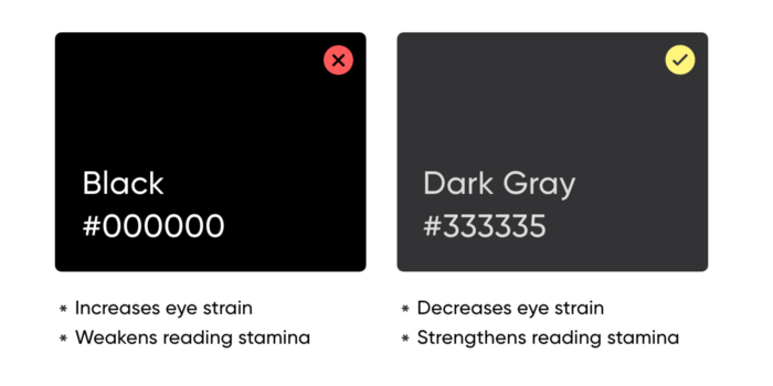
Look at the image below:
Limit Less Saturated Colors
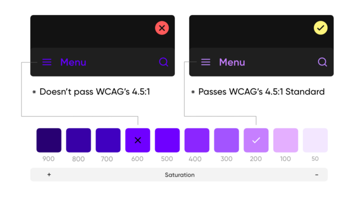
For dark themes, it is important to desaturate the primary colors. Primary colors can bring life to the light mode without a doubt, but are harder to visualise in dark modes. Saturated colors in the 200-50 range are suitable for dark mode UI as they offer better readability.
The lighter color versions help to maintain appropriate contrast for the eyes as they reduce visual vibrations.
Contrast is the Key
Dark surfaces must be darker enough to use the white or light text over it. The ratio recommended by Google Material Design is 15:8:1 between the text and the background surface. It is advised to validate the contrast and check content for accessibility purposes. Wider ups and downs in the contrast hampers the usability of the software application significantly.
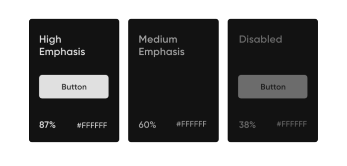
Emphasis Over Text Opacity
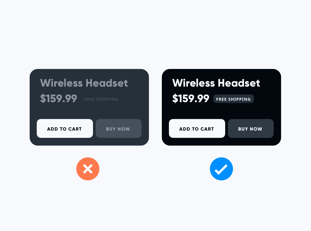
There are a few recommendations in the context of text opacity. The high-emphasis text should have an opacity of 87%, the Medium emphasis text is applied at 60%, and The disabled text uses an opacity of 38%.
Proper Use of Elevation Colors
The colors used to give the visual of elevation are as important as anything. The more elevated the surface is, the stronger and brighter the overlay becomes. Elevation is critical in emphasizing the important elements in your theme. Unlike the light mode where shadows are used to elevate elements, it is impossible to use shadows in the dark mode for the same purpose.
In dark mode, elevated surfaces and components are colored via overlays.
Dark-Light Switching Mode Must be Manual
Of course it is more preferable to give a thought that a system auto-switch the dark mode-light mode. But reality is that it could result in a bad user experience. The software users must do that when they need to. Your job would be to give a good run of tests to review the light mode themes and the dark mode themes to deliver optimum UI & UX as a result. For testing, the best time would be post sunset when incandescent lights can play a huge role in identifying the effects of the dark mode.
Hope you liked what you read to create stunning dark themes. You can use a design system to create software products in light mode or dark mode in a shorter space of time.

