A landing page isn’t just a web page where you add content that explains the purpose of your business, it is basically your shop window, your lead generator, and your main operation’s conversion portal that instruct your visitors to take product/service buying action, so you better take careful care designing it!
While social media users might find your services by chance without the intention to look for them, people who are actively searching for key terms in Google are proactively looking for a solution to their problem.
The key to succeeding in your landing page design is to pay focus on what best practices can increase your conversion rate on your site
Here are some main points that can’t be missed:
Set a layout
The elements to be designed for a landing page are the following:
- Headline
- On-page copy blocks
- CTA buttons
- Complementary images and video
- Social proof section/ testimonials or collaboration data
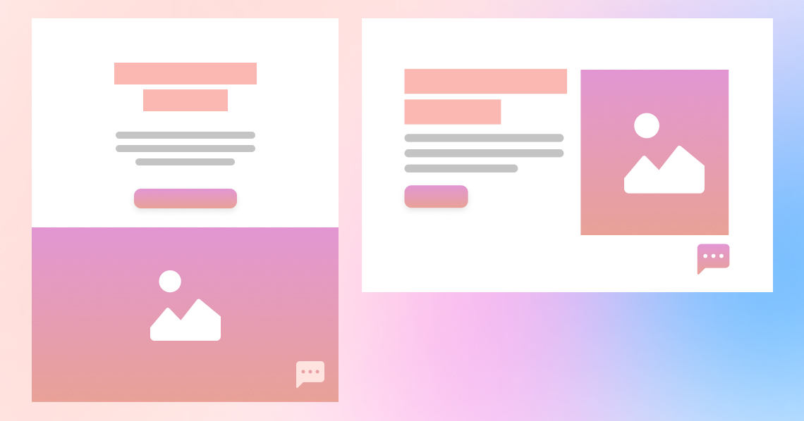
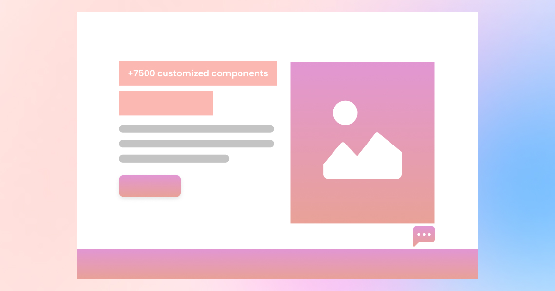
You can be creative with your page and make it the way you want, but there is always page anatomy to follow that consists of different elements such as color, typography, and spaces. The layout you go with should be consistent and match the rest of the web pages. The best way to guarantee the designing of a correct structured landing page is by using design system guidelines to avoid the burden of wasting time defining what a page should look and feel like. A design system will automatically take care of maintaining consistency and branding throughout every element, you design. Not only that but also save your designs and components with robust documentation to be reused and customized when needed.
Read more about how Design systems operate?
Highlight the customer support you are offering
You would definitely need a professional copywriter to notch this one!
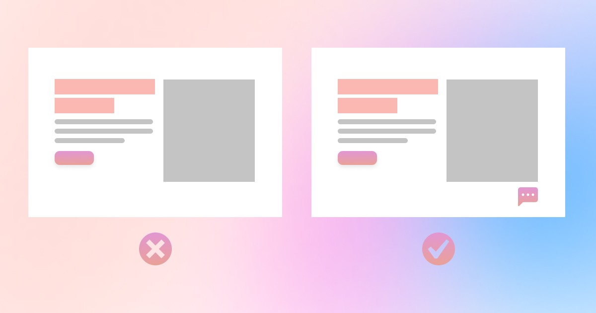
A landing page should have a specific layout, respect user interface anatomy, display the right amount and quality of content with the right structure. The information architecture should follow the logical path that the user’s eyes take while scrolling a webpage.
The human brain tends to scan the outlines, highlighted parts, and bigger scale content first and then take an instant decision whether to go through the details or just pass.
It is very important to carefully determine what outlines you want your user to focus on while scrolling, elements that convey best your business’s purpose and content architecture that highlights your services to the user to take action. Beyond client preferences, a landing page should SEO friendly and equipped with the right keywords that help Google rank it higher according to user researches.
A customer should have a clear understanding of what are you exactly offering at the first glimpse.
The main points to be highlighted in your design are:
Clear explanation of the offered solution
Who can use the product? What user needs to be fulfilled and how? How the proposed service or product can help the customer solve a specific problem and achieve measurable results?
Put yourself into your target shoes while writing your landing page content and write what would have made you purchase that service if you were the user. It is recommended to be as transparent as possible with your users, we are in 2020 and fancy landing pages with a low given value might help gain some attention but won’t build you a reputation!
Benefits of using the promoted service
What advantages come with using the offered product or service? What makes your product the go-to solution? Any extra options you offer?
This section is the key to differentiate your landing page from competitors.
Studies have proven that users feel way more comfortable using a service that offers free consulting with experts rather than just static email guidelines.
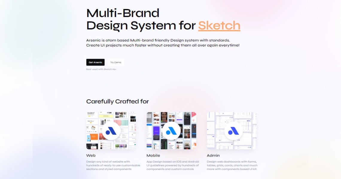
Take a look at Arsenic Design system landing page
Tell the product realization story
Explain the drive and passion that started the business idea. Users tend to relate so much to such stories. It builds customer trust in your product and your vision and drives the user curiosity towards getting to know your team and try a demo if possible.
Integrate call-to-action buttons smoothly and clearly
CTAs are the drivers of your conversion rate!
A CTA button should be clear, compelling, visible, and very well positioned within the page. There is no point in designing a landing page with the most impressive content if the user can’t find instantly the buttons he needs!
Multiple CTAs might confuse the user and impact negatively on your conversion rate, but offering progressive CTAs is very recommended towards helping the user take action comfortably:
For example: “Try a free demo”, “Buy a 6 months plan”, “Get a yearly plan”
Design-wise, a CTA anatomy consists of 3 primer components
- Color
- Typography
- Spaces
Then complementary aesthetics like depth, iconography, and Motion. An effective CTA button should be appealing and matching with the page as a whole, with a decent eye-catching design that makes users want to click.
Arsenic Design systems’ specific control panels help you customize every aspect of every discernible component. With consistent practices, UI guidelines for every kind of platform, and ready-to-use layouts, you can optimize your practices and design top-notch landing pages for web and mobile easily in no time!
Design for every device
Highly compatible design affects positively the user experience and the overall judgment about your product, and so can highly influence the user decision. It is crucial that your landing page is responsive!
The design should remain consistent and responsive no matter on which screen or device it gets displayed.
Whether it is a laptop, desktop, iOS, Android, tablet, etc. Your landing page should be scalable, fast loading, and perfectly fitting!
Optimizing your landing page for mobile mainly helps to generate traffic towards your website and increases your chances of conversion.
Back up your landing page with visible testimonials and collaborations
Emphasizing testimonials or social proof and previous collaborations helps the user build trust in your product.
It is very important to remember that users who land on your page via paid ads out of curiosity have a totally different mindset from those who find it via their own research, Google Ads, or referral links!
Users believe in numbers more than words. In order to create a targeted landing page, you need to present enough data that showcases your legibility and back it up with numbers. A simple phrase like “300+ clients this year “ can do wonders!
Highlighting your previous collaborations and partnerships is very important. If the user is familiar with those partners, it would automatically set his positive judgment towards the service you are providing. It demonstrates service/product quality and reputation.
You might also read