Hello mates! Repeat after me: Blur is clean… Blur is clean…!!
Sounds confusing, isn’t it? Friends, we are talking about the most extraordinary elements in UI designing. In this blog, we are discussing the pointers to keep in mind for designing elegant, clean, yet simple blurred backgrounds. After all, website design and mobile app design are done with a purpose. And that is to grab the visitor’s attention effortlessly.
By this time, you may know the purpose that blurred backgrounds are used to emphasize the content (visual or text) or icons which are elevated or just overlaid. However, there is much more to it. So why wait? Let us find out.
Techniques used in Blurring Implementation
To start with, you should know how to blur any image. Three ways to implement this technique are:
Linear Blur Image
Perhaps the simplest technique of all, this way an image is blurred by horizontal and vertical averaging of a fixed number of pixels. However, compromise needs to be made with the blurred quality.
Block Blur Image
In this technique, averaging of a small black of pixels by propagating a fixed sized window across the whole image is performed. The blurred quality is somewhat improved as far as linear blur is concerned, and lines are not visible anywhere in the output.
Gaussian Blur Image
The best of the three, this technique presents the convolution of the image with a two-dimensional Gaussian function. Gaussian technique has been in the use of many commercial softwares, such as Adobe Photoshop.
Tips to Design Perfect Blurred Backgrounds
Blurred effect is indeed an effective solution while working on the UI having multiple layers. The end goal behind this is to give the users a clear understanding about the user navigation. Because we, the humans, have a tendency to look at the objects which are highlighted, in focus. Not those which are blurred or out of focus. Following are the UI design tips for creating excellent blurred backgrounds:
Elevate with Neutral Colors
Always look to elevate the elements with colors. Just as the dark mode, colors are used in the UI with blurred background for elevation or to show a layered visual hierarchy.
It is advised to use pure white (#ffffff) or pure black (#000000), sometimes consider using the shades of gray color. The thing is that such neutral colors are the best choice for layers with blurred surface background. Vivid colors may seem awkward and not the right fit for the background below your UI.
Bring More Readability
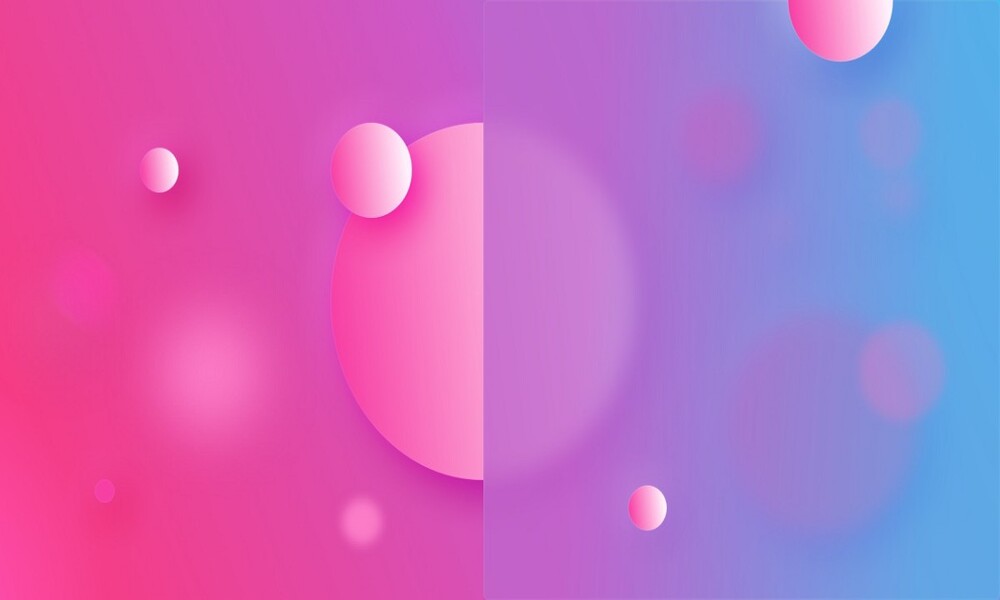
For more readability when specially a text is overlapping a blurred background, contrast between the both matters the most. The textual readability will only come good if you blur the background with a large value. Applying a trendy visual style does not let us sacrifice overall user experience.
It is advised to try and experiment with values(ranging from 16-24px blurs) that help to establish good contrast.
Adjust Opacity
Besides the contrast factor, opacity too, plays a significant role in bringing the user attention to the elements in the UI you wish to highlight. You must remember that too much opacity makes the blur effect look ZERO. Whereas, too low opacity will merge and blend the colors of the layers into the background.
Hence, a balance needs to be there, which needs to be done by setting the opacity to somewhere in between 30% to 60%.
Don’t Push Blur Limits
It is not only about opacity, Blurred background requires a good balance on its own. Hence, a proper blur value is important to select to make it look perfect for with the overlapping elements.
If you blur the layer too much, the effect of nice gradients in the background will disappear.
Elevate Layers with Everything Intact
This is a trick I use in my projects. To build a visual hierarchy in blurred and translucent UI components, I use the same style for headers, sections or cards.
If your blurred panel or card has grouped elements or a bar, try to elevate with the same layer style. It gives nice results.
Choose Right Background to Use
Choosing and applying a perfect background is also necessary. A background could be an image or gradient. You need to select to serve the purpose to your overall UI design thinking.
However, it is advised to apply the blur effect only to the images or gradients to bring more depth effect. Blur effect is not needed when the background used is solid.
To Conclude…
There may be many techniques and thoughts given to the blurring effect in UI design process. The purpose of this article is to make you understand that it is all about creating a blurred effect that fits and blends perfectly across the design.
What do you consider when you are about to work on the same thing? Share your thoughts with us too!
You might also read