Contrast is the art of comparison, differentiation, and dissimilarity in Design. Unlike what commoners think, Contrast goes way beyond differentiating simple black and white or large and small and it has huge importance in the design world!
So how to contrast your designs like a pro? Here are the best tips and practices suggested by cohort design masterminds
Why contrast is important in design?
Contrast is one of the very basic design principles and like its fellows, it adds considerable value to the design, and leveraging it professionally is what differentiates one designer’s work from and another. Designers use contrast for various reasons mainly for:
- Emphasizing the focal point of your design
- Adds visual interest
- Key to readability
- Establish hierarchy
How to obtain the right contrast in your designs?
There is no magic formula to apply but there is one rule “not too much not too little ..balance” but here are the best practices to improve your skills in leveraging contrast :
Play with Dark and Light values
The most basic way to start contrasting is by creating a kind of non-flow between light and dark values. You can superpose a color by its darkest value. This trick applies to all colors not only to black and white which are ultimate contractors
Control different color Temperatures or intensity
You can easily create a nice contrast by displaying different color temperatures such as warm(regs oranges yellows ), cool (blues and greens), and neutrals (black-white, beiges, and ground colors). The combo warm/cool can create a dramatic effect
Mixing color temperatures in a design—particularly warm and cool—can create a dramatic contrast.
The same goes with playing with colors intensity also known as saturation
Use complementary colors
You might think the color wheel is there to create harmony not contrast but you are wrong! Complementary colors (opposites on the color wheel like blue/orange or the red and green on most Christmas cards ) or split-complementary are perfect to create a statement contrast.
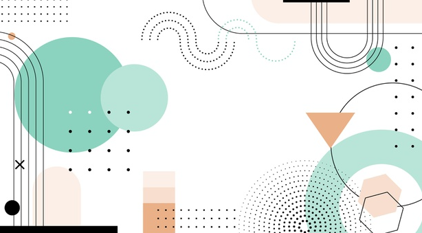
Contrast with shapes
Not only colors create contrast even shapes can do great. Combining the sharpness and edginess of geometrical shapes with the smoothness of organic ones can make contrast wonders! You can apply the same concept in typography and buttons as well by contrasting sharp corners with smooth ones.
Play with different textures
Another way to avoid the overuse of colors for contrast is by contrasting different textures rough/hard flat/elevated etc to give a visual contrasting effect. This technique is mostly used in logos and graphics
Display different scales and sizes
Contrasting by displaying different sizes and scales is a great way to elevate your design visually and highlight focal points. It can be perfectly used with text and shapes to create a hierarchy
Negative spaces are your savior
Many new designers fall under the wrong umbrella of thinking that empty vacant spaces in their design are a sign of their lack of creativity and experience. You can’t fill every bit of space, don’t you? Well, Under the right umbrella of design thinking, Negative also known as white spaces are the foundational contrast and the highlighter of different UI elements!
Read more about how to master the use of negative spaces in design
Combines fonts smartly
Most designs do have typography in them. Pairing fonts is a whole process and can often lead to font conflict but if done right you can eventually create a meaningful yet simple contrast
Get to know how to pair fonts like a pro
Conclusion
Now that you got the best tips suggested by cohort experts it is your turn to practice! you can also make the whole process consistent and much easier by adapting our Arsenic Design System and share your feedback and results with us!
You might also read