Disclaimer: Whatever will be mentioned on this list is: 100% frustrating and negatively experienced and perceived by all kinds of users!
Weird, boring, frustrating design patterns: We are sure you came across them multiple times before as they keep on chasing everyone from one website/app to another. Unlike any other year, 2020 and 2021 marked by the Covid-9 impact on user behavior, revolutionized the world of user experience design. Although Design systems highly contributed to the amelioration of some aspects of UI/UI design, and so there are many practices designers should avoid in 2021 and upcoming years. Those design patterns have been reported over and over again by users, but became established over time and ignored by most usability tests.
This blog is listing some design patterns that you should absolutely forget about!
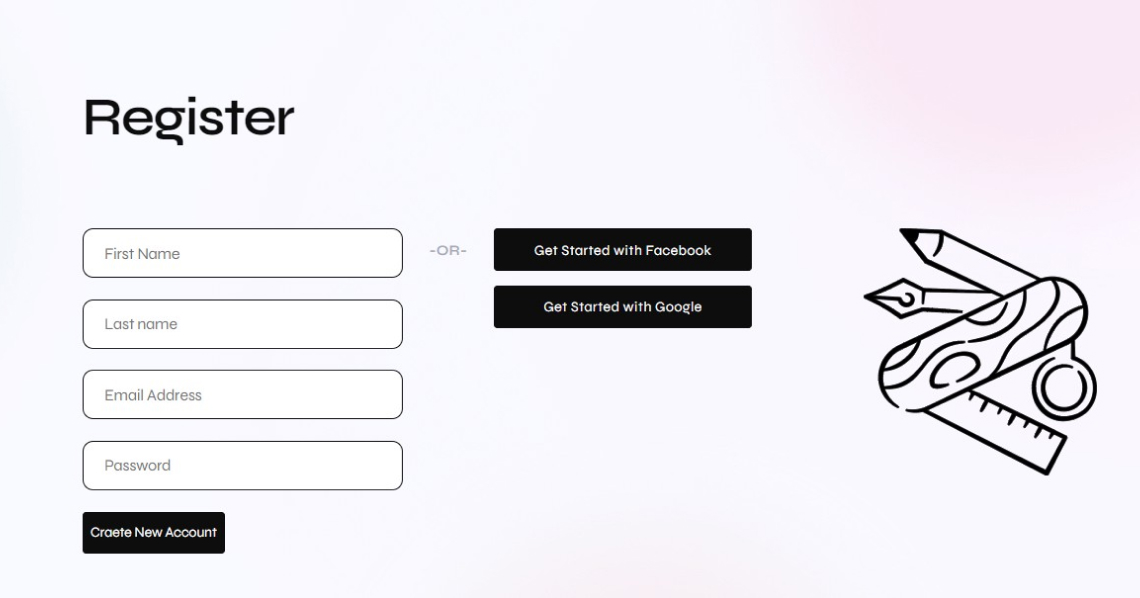
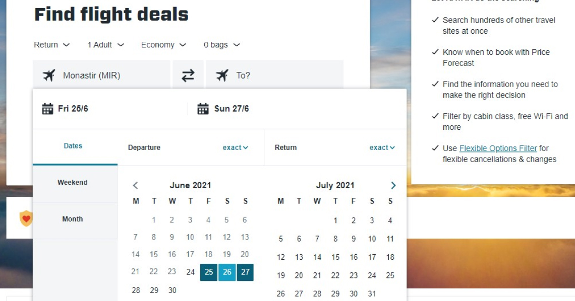
Birthday widget picker
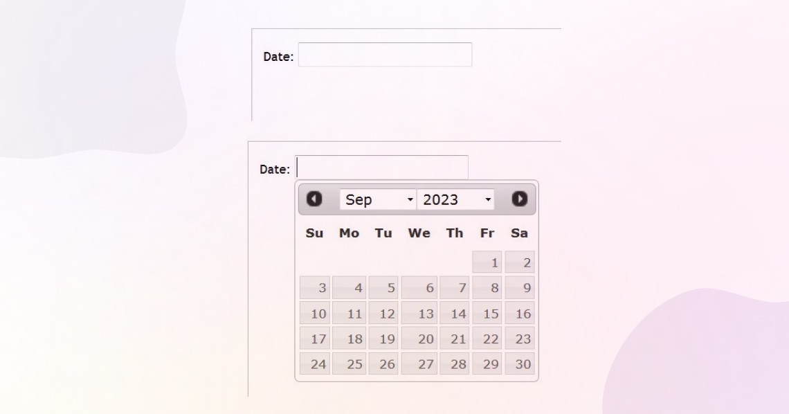
What’s the most boring part of signing up or filing any online form?? The very infamous, bothering, and slow birthday picker widget/dropdown! Known for being often inaccessible, frustrating and confusing, and sometimes too time-wasting to be true.
This birthday picker calendar in a native or custom widget or a dropdown is the easiest escape for many designers as picking a birthday date via mouse integration as it has obvious importance in the creation of any UI whether it is a flight booking website, an online bank form, a CV creator or any UI with personal detail input inquiry. It’s a practice that has been used for a long period and got validated by QA testing over time that it turned into a design pattern for common use. Although it is compatible from a technical point of view as it delivers a correct, error-free, and unified input easy to read and analyzed by the system, it is still a practice that needs to be avoided and replaced due to its low performance regarding user experience.
One suggested solution is to adequate the birthday picker widget to both mouse and keyboard entries and provide simple guided steps that are technically accessible.
Long-Form Designs
Form design is another boring and time-consuming pattern that is inevitable, especially in the web creation process. The input within the form in some websites is often seen as irrelevant which leads to a long layout, slow UX, and even pale appearance.
UI/ UX design is supposed to be the art of solving user problems design while design forms serve the purpose by limiting user mistakes and info biases, yet it also causes the interruption of the user and misleads its focus on the website services.
According to cohort experts, forms are the most complicated aspect of the user experience as they are fundamental and can’t be avoided, yet they can lead to serious gaps in the user perspective of the website.
Getting form design to be done right often requires the creation of reasonable and predictable form fields with simplified underlying structure and less of back-end and third-party errors.
A well-done form should follow and respect:
- Complexity limits: The form isn’t displaying a big number of inputs in one single page and has a multicolumn layout to fit the complexity and the screen size.
- A Mental model: The form respects the user’s set of mind, logical information flow, and opinion regarding certain sensitive information.
- Accessibility: The form supports various modes of interaction including proper error communication, clear labels, and visible buttons
- Speed of input: the form doesn’t require much time and effort to be filled correctly.
- Scalability: the form should adapt to format change and language translations.
- Speed of recovery: How easy it is to find errors and fix them
- Success and failure rate: How many users can finish the form without errors.
- Minimal interruptions: the form doesn’t freeze, has reasonable reload time, minimal accruing loading spinners, correct inline validation, etc
Mega-Dropdowns Hover Menus
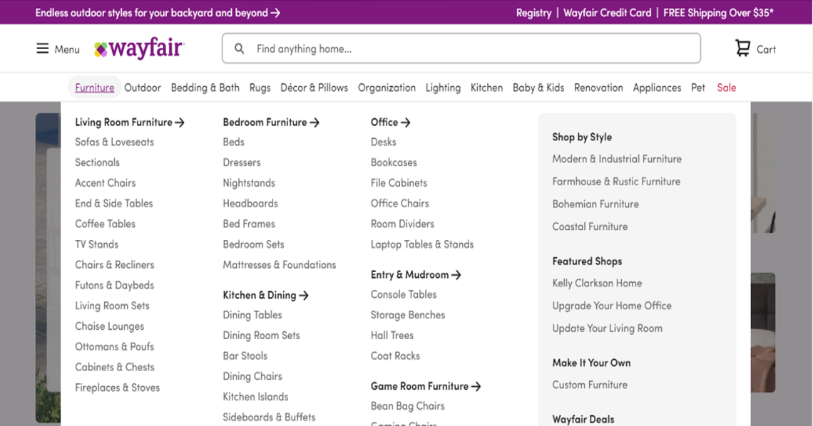
My personal worst nightmare: hover menus! Unfortunately, Overloaded, long, confusing hover menus are so common to find on websites. While developers consider it to be an easier way to track user behavior, users think it limits access to the webpage, and they do prefer the simple on top research tool.
The first aim for hover menus is to help the customer seek the information he/she looking for by navigating the mega dropdown by the category then diving into subcategories
But what really happens…
- The user gets annoyed by the number of times he needs to keep reopening the mega drop-down for each research
- The user starts opening separate browser tabs to avoid the burden
- Sometimes the mega dropdown causes delays in performance
- The user has to open the mega drop-down over and over again if he wants to explore different items within the same subcategory
- The menu keeps on appearing at the wrong moments whenever the user misplaces the mouse
Arsenic design system provides design guidelines to technically tackle a number of problems, including the best practices for fade-in/fade-out transition Implementation within the suitable entry and exit delays smoothening the appearance of hover menus
Conclusion
The examples listed above are only a few compared to the huge number of mistakes made in UI that are still promoted in the market.
We don’t believe in “bad” design patterns, but we believe in the necessity to follow structured guidelines to use them properly. Implementing a design system as a true source and guideline to all your design operations is the best way to learn the best, consistent practices for a successful user interface that provides a successful user experience. Take Arsenic as your next team player!
You might also read