Learning design starts by experimenting with Grids! But why is it so important and which type of grid is most suitable for which type of design?
This blog is a quick overview of all you need to know about grids systems in design and best practices to master their usage for UI, web, print and graphic design, etc
Typologies of grids
The grid system is an organized layout to control the positioning of every element in a design, differentiates one layout from another, and maintain consistent structure throughout the design. The grid used for a magazine print is different from the one used for a UI design.
Here are the main types of grids commonly used in design :
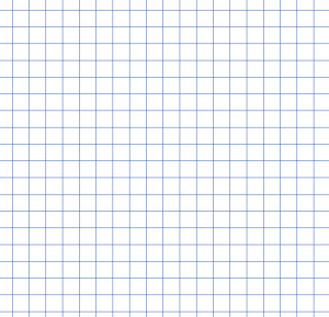
Baseline grid:
A base lien grid is made of constant spaced horizontal lines Commonly used to align text

Column grid
Colum grids tend to split a page/screen into vertical fields to arrange content accordingly commonly used in newspapers and magazine layouts and also for web design
Modular grid the intersection between a column grid and a baseline grid in different proportions creates modules very commonly used in all types of design mainly graphics
Pixel grid Used in all design tools, a pixel grid is a micro modular grid at the size of pixels used for sophisticated editing
Hierarchical grid an irregular grid of freeform composed of different types of grids
How important are Grids in web and UI design
In UI and web design there is no size fit all! Grids are what makes it possible to reform one design made for one screen to another screen size and so websites and apps can fit in all devices they are used upon
UI designers leverage column tools to create flexible designs with a smart structure that fits different screens for example a mobile app content requiring 3 columns can be translated into a web structure of 12 columns grid.
It also helps developers and designers align their visual standards with frontend design by keeping up organized framework
Tips to follow to master using grids
Experiment with different types of grids in one design
Don’t get restricted to one grid try to experiment by building your own Hierarchical grid to create different visuals depending on the purpose of your design. Using the same grid over and over again might taim your creativity and ability to innovate structures.
Choosing the Right Grid according to your project needs
Choosing the best grid will depend on what kind of design will you be working on. While Designs with lots of text, need layout grids, Designs with lots of abstract color and shape compositions need other irregular types
Plan the negative space around your grid
Whatever content your grid is made for should start and end according to the grid proportions. Negative spaces or empty spaces serve as limits to every grid and shouldn’t have any text or graphics on them.
Keep up with Consistency in the superposition of elements
Making sure that all the text in a column-based design also sticks to a consistent baseline can make a big difference to the sense of harmony and organization on a page.
Spare yourself the headache! Just consider implementing a design system!
Make your designs clean and systematic and easily scale them perfectly in full consistency adapt Arsenic Design System!
You might also read