Tips to Pair fonts in UI like a pro
When we think design, we think shapes, color templates, and a smart combination of matching fonts! As a designer, it is crucial to be able to pair fonts and establish a clear hierarchy by size and weight in your designs but don’t worry Arsenic design team is here to help! Whether you are aiming to design logos, infographics, or UI templates, etc, here are the best practices recommended by our experts to pair fonts like a pro!
Understand the science behind font pairing
Superposing fonts isn’t a random process, it follows a scientific approach of how user’s eyes navigate on the screen to find information. The logical flow categorizes per size and positions the:
- Headings
- Subheadings
- bodies
- captions
Each category has different anatomy and Pairing fonts is about leveraging different elements of this anatomy
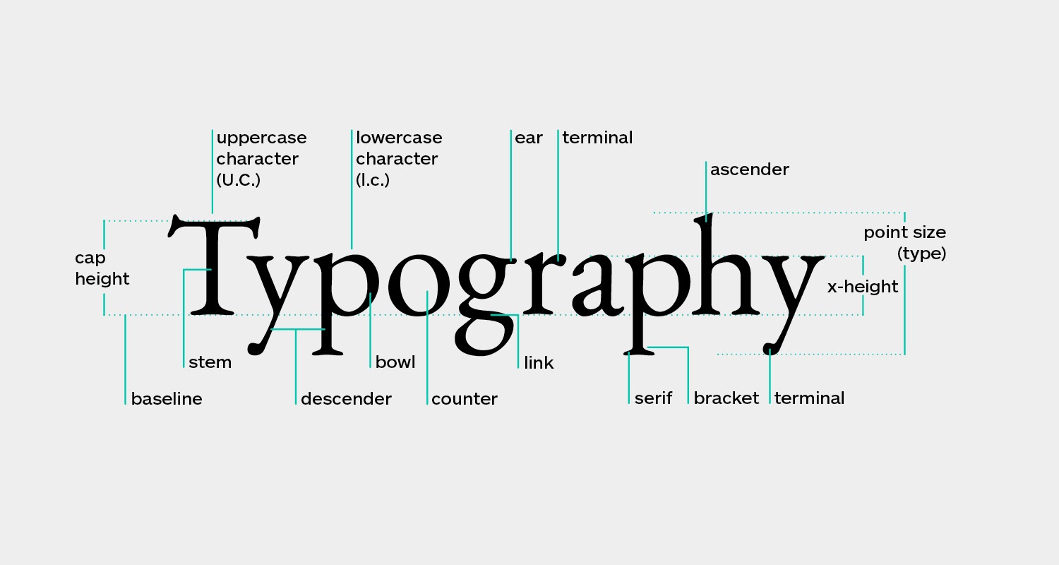
Choosing a typeface isn’t just about whether you like it or not, it’s about how the words in your copy look when the typeface is applied.
Compose from the same typeface families
Sometimes being over-creative with visuals won’t get you what you want. When it comes to UI typography is a matter of information display in a clear, hierarchical, and objective way which is definitely not about showoff your visual design capabilities.
The easiest way to effectively pair fonts in UI design is by opting for using fonts from the same prearranged typeface family. A family of fonts includes serif and a sans serif version of the same font such as Lucida/Lucida Sans
Pair contrasting typefaces
The fonts you use in your design although are different must be complementary. Example pairing a serif with a sans serif. Then pick transitional fonts from subcategories with stronger contrast between thick and thin.
Example pairing Bookman with Geometric sans serifs such as Avant-Garde
Speak for the brand
You might think that it would be way easier to just re-use popular font pairings that you saw in some brand UIs.
If it happened to you to copy fonts from other brands before well… don’t make it a habit! it doesn’t always work!
Typography is meant to speak for the brand so what matches a brand doesn’t necessarily match another. Some brands like sports platforms require a UI with simple, clean, modern, and geometric typography that matches the brand aim straightforward while other brands like fashion platforms are built with a UI of luxurious, modern, and classy typography.
Prioritize picking the body and caption content font then look for the rest
Content is presented in a hierarchy. Although headings are the most visible and attractive structures, picking the rights fonts to start with the body font first. Why? Because it is built with the tighter size and constraints that make paragraphs and long sentences that need to be legible, readable, and clear. The font you apply for the beautiful heading won’t necessarily be readable and appealing at a smaller weight but the opposite is fine.
Don’t rely on similar fonts
Most UI design beginners find comfort in using the same or similar fonts at different scales which is a mistake! Take the slight risk of experimenting with additional fonts. You can apply technical, futuristic sophisticated fonts for headers while opting for simple angular geometric ones for the body and caption content
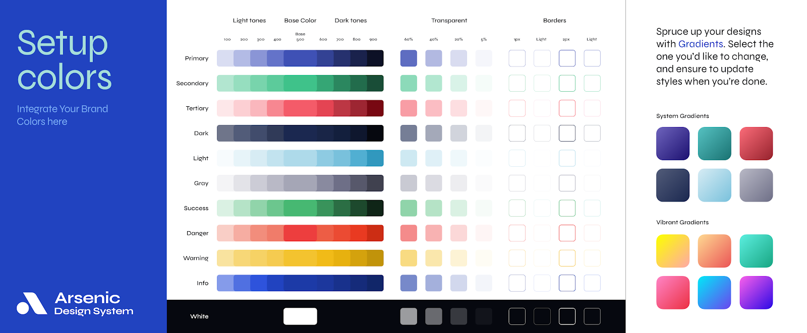
Pair fonts like a pro with Arsenic Design System
One font is simple…two fonts are bearable …more fonts mean complication in application! Where to use who?
Arsenic is built to serve consistency to all designs and nothing less by projecting necessary guides to brand identity with detailed toolbars that control every discernible component including detailed typography set up to help you match fonts like a pro!
So why bother to visually design every state of every screen while you can think more efficiently and operate by Assembling all components Line of UX/UI in a contribution space! Take Arsenic as your next team player!
You might also read