Designing an appealing UI never was about how many colors would you include in it! The color theory is a vast world with endless combinations to create various color palettes. However, if you are looking for a cohesive, clean yet sophisticated approach to design UI for your next big thing…Consider a monochromatic scheme!
Easier said than done, right? Well here are the main steps recommended by Arsenic Design experts to design a successful monochromatic user interface.
Keep in consideration the Light and Dark Mode of the app
Before you start setting any basics of your UI think how it would like in dark and light mode FIRST! The dark mode is now a must-have in every digital solution and unfortunately, not everything that looks appealing and user-friendly in Light mode UI would look the same in dark mode.
It doesn’t mean that you should run for basic black and white to relieve this burden but just make sure that whatever palette you are opting for should be consistent throughout your design
Set a base color
Any monochromatic design has a dominant color that will be used to generate the rest of the palette. If you get this step wrong both color generation, light & dark mode would be failed.
Note that It is harder to build UI when you are working for a certain brand as you will have no many options but to build-on brand colors.
If you are free to choose a dominant color I would suggest that you stay away from blue. I know it is the most commonly UI used theme and the easiest to grade colors from. Yet I do encourage more effort and creativity as blue becomes so overused!

Define and understand your shades, tones, and tints
Monochromatic rules on shades, tones, and tints. Mono never meant the use of one boring shade of color all over your UI but the variation, generation, and display of shades, tones, and tints from base colors.
- Shades: the base color darkened with black.
- Tones: the base color desaturated
- Tints: the base color lightened with white.
Play with light and saturation
Swatch your chosen base color to design smaller interactive elements like buttons. Swatching can be done by playing the saturation and light degree of your base.
Increase and decrease the contrast of the layout colors
Usually, layout colors are neutral also known as earth colors varying from basic white, gray, black to pale beige. They are used to differentiate sections, groups of information, and elements of your UI.
Play with the contrast of your neutral to build up sidebars, information fields. You can increase the contrast to emphasize your dark mode.
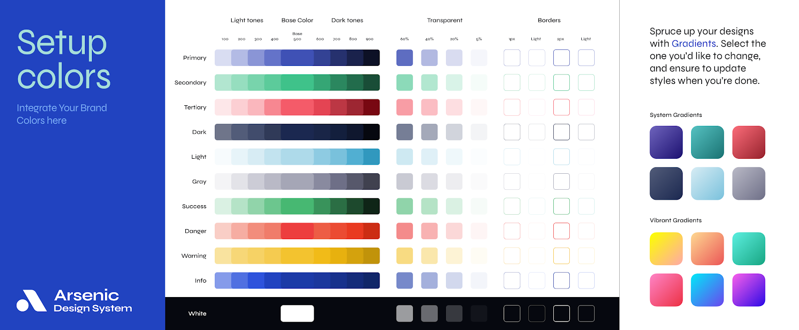
At the end of this process you will have an easy-to-use palette that consists of: a Base color, Lighter base variation, Darker base variation, Low contrast neutral, high contrast neutral for light mode, and a high contrast neutral for dark mode.
Build a monochromatic UI like a pro with Arsenic design system!

Arsenic was built to serve consistency to all designs and nothing less
Arsenic is meant to maintain high-quality consistency throughout every design and project by providing necessary guides to brand identity with detailed toolbars that control for discernible components that you’ll use to construct your digital product.
So why bother to visually design every state of every screen while you can think more efficiently and operate by Assembling all components Line of UX/UI in a contribution space!
The monochromatic approach of Arsenic
Take Arsenic as your next team player!
You might also read